By decor8

I’m not so sure about these colors of the year lately, are you? Last year, Pantone told us that radiant orchid (post here) was all the rage. Now color experts Pantone are now celebrating marsala for 2015 which is somewhere between a dressed up version of terra cotta and a less intense merlot. For fashion, I can see it – a nice marsala lip or nail works for Autumn just perfectly. But for the home, well that’s a harder sell for me. In fact, this is a hard post to write because marsala doesn’t appeal to me but since I like to challenge myself, I wanted to source several great spaces that incorporate marsala that even I would like. Ultimately, you can judge whether or not you’d use it in your space but my 8 tips are a great starting point if you’re a little marsala shy. And who knows, by the end of this post, this color may even win me over.
image: Lonny
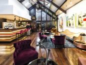
1. In a small, bold space. If you live in a charming apartment in Chicago or Manhattan or even a bungalow in LA, and you love a good global, well-traveled vibe, then marsala can be worked in to your interior if you accent with brass and mix in lots of blue and orange. The space below looks like a textile designer, buyer for a great interiors store, mag editor, stylist, author or designer occupies this space. Someone with class and style.
image: Elle Decor featuring space of Interior Designer John Saldino
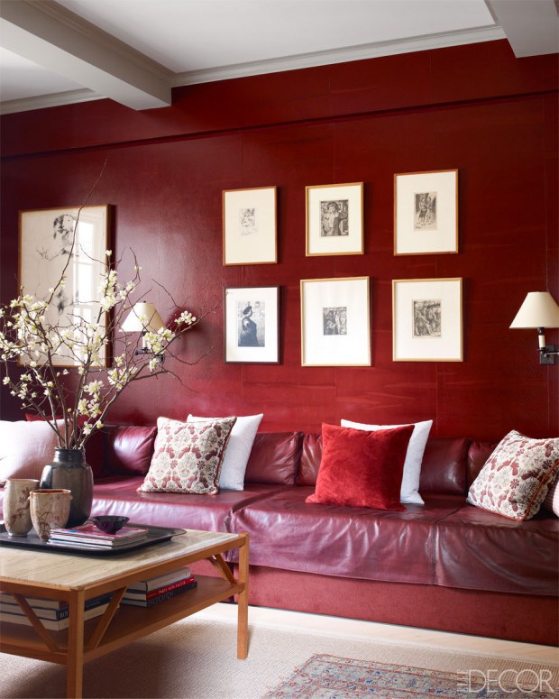
2. Global + Bold. Marsala needs to be either all or nothing in a room, in my opinion. A simple accent or over-the-top flashy. This space is positively soaked in tones of red, including marsala. The creamy whites and natural woods ground it as do the white cherry blossoms which make the space feel less formal. I keep seeing textiles, ceramics and art from countries like China, Turkey, Morocco and India because this color is definitely more common in those countries – I’ve been to both Morocco and Turkey and found loads of marsala in the bazaars there in everything from pottery to throw rugs.

image: Staffan Tollgard Design Group
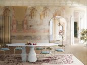
3. Classy with a bit of Hollywood glam. Marsala works in a space where the foundation is neutral and the lines very classic like this elegant flat which feels very Hollywood despite that it’s in Notting Hill decorated by Swedish designer Staffan Tollgard. It looks oh so glamourous. What works here is that marsala is only used as an accent color on the dining chairs. No where else. The flowers in tones of red and purple help the space overall to feel more balanced so there is less of a contrast between the deep dark chairs and the creamy white floors, walls, ceiling, built-in bank, etc.

image: Pernille Kaalund for Bolig magasinet
4. A bold single piece. This eclectic modern space with a bright white base and tons of natural light is a nice place to use marsala as an accent color. Blue, yellow, orange and red work great with this color. If you want to use marsala in this way, stick to a single piece and mix in other colors.

image: Pernille Kaalund for Bolig magasinet
5. Rugs. Marsala works in perfectly in rugs, have you noticed? And you can find this color in so many rugs that are sourced in Turkmenistan, Turkey, northern Afghanistan, Morocco, Uzbekistan and India. And because they’re on the floor, and usually combined with other colors and patterns, marsala becomes a nice stable tone to ground the room overall.

image: Pernille Kaalund for Bolig magasinet
6. Small Accents in the Kitchen. A tea box, a frying pan, wood stain, or in a rug. Mixed with indigo, a hint of mustard, brushed metal and reclaimed wood it really works without feeling dated or bad 1980’s (vs. good 80s).

image: Houzz
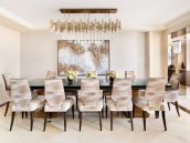
7. With bright primary orange, light gray and red. In a contemporary setting, marsala works great with bright red and orange nearby because both bring heat and energy and marsala neutralizes them a bit. With gray, wow what a winning combo! Makes marsala feel more modern and clear somehow.

image: Brittany Ambridge for Domino
8. Artwork. You may not have noticed the painted above the sofa at first glance because the rug clearly dominates, also in marsala, but the painting really brings the eye up off of the floor and harmonizes the space from a color perspective. This room is really lovely and that rug lifts the room making it feel very peppy and even a little sexy!
So, you tell me – Marsala – Pantone Color of the Year – Hell no or hello? I like it but only if it’s combined in a pattern (like a rug) or in artwork, a pillow, etc. But I don’t like it as a solid color accent (like a chair) or as a wall color. What about you?
(images linked to their sources above)
Source:: http://feedproxy.google.com/~r/decor8blog/~3/kvg5TzGL2cY/