As we know (and we’re used to), Pantone releases each year the colours they expect to trend in said year. Well, this time, after making the ballsy move of establishing Ultraviolet as the 2018 colour of the year, the famous colour institute released what they expect to trend this fall. Four our ecstasy, the 2018 fall colour trends are filled with bold, bright and fun colours. join Interior Design Blogs and say goodbye to the usual plain, boring, dull and uninspiring tones and welcome a new set of joyfully trippy shades with the Pantone 2018 colour trends.
⇒ Subscribe our Newsletter here and always be up-to-date with our posts! ⇐
[BDCK category=3 Keywords=”DL-Product”][/BDCK]
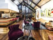
PANTONE 18-1549 VALIANT POPPY

Imagine you have this monumental ruby in your living room. But instead of a ruby, it is a beautiful armchair with that same colour. That’s where Pantone’s aiming with this colour. Bringing the luxury attached to the jewel, but using it creatively in your decor. This warm colour will bring lust, luxury and comfort to your decor (and, truth be told, a certain Spanish Fly too).

![]()
PANTONE 15-0850 CEYLON YELLOW

If you’re feeling exotic, then this is the perfect colour for you. This yellow-ish shade is on the threshold of gold and the greenery of brass, which can go perfectly with a beach-house themed decor. Even if you don’t have a beach house, you can still use it perfectly in your mid-century decor that we know you love. This shade takes us back to the wonderful 50’s, in that awesome dinner where we’d listen to Elvis Presley while we’d eat a burger and sip a milkshake. We might feel nostalgic towards those simpler times, but that doesn’t mean we can’t bring them back, does it?

![]()
⇒ SEE ALSO: LEGACY, A LUXURY DESIGN MAGAZINE BY THE EXCLUSIVE BRAND BOCA DO LOBO ⇐
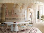
PANTONE 18-0625 MARTINI OLIVE

Now this tone, despite its name (martini olive), is the sober one of the group. Described by Pantone as a ”smooth, sophisticated and urbane green”, this tone will bring depth to the colour palette, and it’s perfect for those of you who aren’t very keen on bolder colours. First, it’s not boring. Second, you can pair it with pretty much every colour. Imagine you got yourself a nice, martini olive sofa, now throw on top of it some cool, modern yellow pillows. Congratulations, you got yourself a trendy living room.

![]()
PANTONE 12-0740 LIMELIGHT

Limelight, the perfect colour for yellow lovers. It’s yellow, but it’s not that in your face yellow, which is good. And that’s usually the issue with yellow in decor, it’s too bold. Well, with this shade, you won’t have that problem. This tone brings freshness to the decor and will make you feel the same bliss you fell in Spring, but in Fall. Remember when above, in the martini olive section, we suggested some yellow in the decor? Well, this is it. You won’t find better pairing than this one. Not even on Tinder.

![]()
PANTONE 18-5025 QUETZAL GREEN

The inspiration for this tone was drawn for the graceful Quetzal bird, which is regarded as Central America’s most beautiful bird. And, if it looks good on a bird, imagine on your decor! This shade is perfect for upholstery, sofas, armchairs, rugs, you name it. It will bring some depth to your decor, richness that is incredibly hard to find and, most important, that luxury accent you’ve been looking for. The perfect choice for any decor.

![]()
SEE ALSO: CELEBRITY HOMES: KENDRICK LAMAR CRASHED IN THIS COOL CALIFORNIAN VILLA
[BDCK category=3 Keywords=”BB-product”][/BDCK]
Did you like this post? So leave your comment and share it on your favourite social media!
Your feedback helps us to improve.
✭
Source: Elle Decor